
The regular season for the WNBL concluded last Sunday.
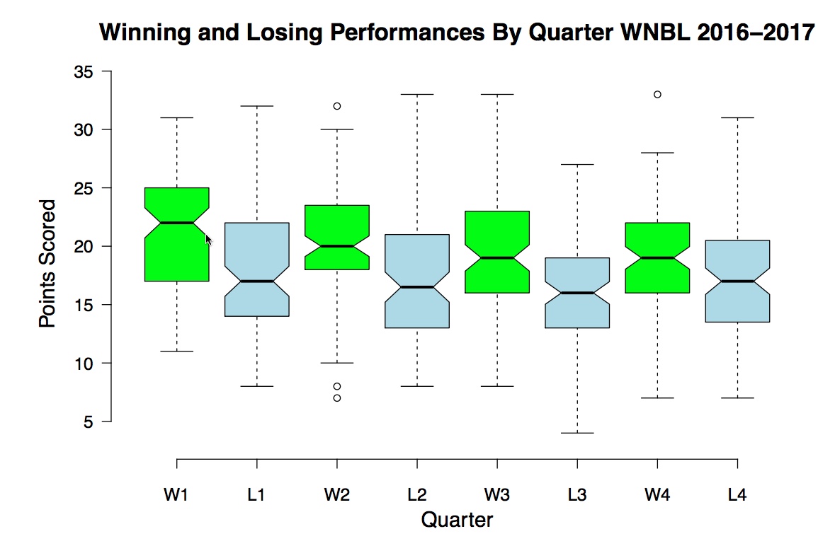
I monitored the scores per quarter in each of the 96 games played. I was interested in the points gap between winners and losers within and between games.
My basic plot of the median difference per quarter for 96 games is:

I noted the closing of the points difference in the fourth quarter of games. Alan Gabel and Sidney Redner (2012) in their discussion of random walk behaviours in basketball, observed:
Another intriguing feature of basketball games is that the scoring probability at any point in the game is affected by the current score: the probability that the winning team scores decreases systematically with its lead size; conversely, the probability that the losing team scores increases systematically with its deficit size.
Leto Peel and Aaron Clauset (2015) comment on this restorative pattern too.
To extend my visualisation of the performances of winning and losing teams, I returned to the excellent BoxPlotR. This application:
allows users to generate customized box plots in a number of variants based on their data. A data matrix can be uploaded as a file or pasted into the application. Basic box plots are generated based on the data and can be modified to include additional information. Additional features become available when checking that option. Information about sample sizes can be represented by the width of each box where the widths are proportional to the square roots of the number of observations n. Notches can be added to the boxes. These are defined as +/-1.58*IQR/sqrt(n) which gives roughly 95% confidence that two medians are different.

My plots for the 96 games are:
Winners


Losers

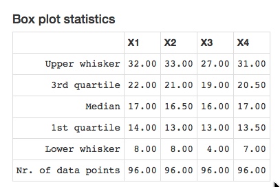
Winners and Losers Compared
This is the third time I have used BoxPlotR to visualise data. It is the first time I have used notches in the visualisation. My other attempts were to visualise the numbers of caps per country at RWC15 and goal-scoring netball performance in a test series between Australia and England in 2016.
I have found BoxPlotR an ideal application to generate box plots compared to the limited functionality available in Google Sheets where I curate my data. I did not have much success with Excel either.
If you would like to learn more about the evolution of BoxPlotR, you might find this editorial (Kick the bar chart habit) and Daniel Evanko’s blog post (Bring on the box plots) of interest.
Photo Credits
Recap of Round 19 (WNBL, Twitter)
The Last Game (WNBL, Twitter)


